Case Study
LA TIENDITA
A Mexican Bodega in Berlin
Client: LA TIENDITA
Location: Neukölln, Berlin
Project Scope: Brand Identity & Storefront Design
Challenge:
Creating an identity for LA TIENDITA required balancing two opposing forces: standing out in the vibrant chaos of Neukölln while also seamlessly blending into the neighborhood as if it had always been there. The owner sought authenticity, but an overly traditional Mexican aesthetic risked clashing with the area’s underground punk ethos.
Concept & Approach:
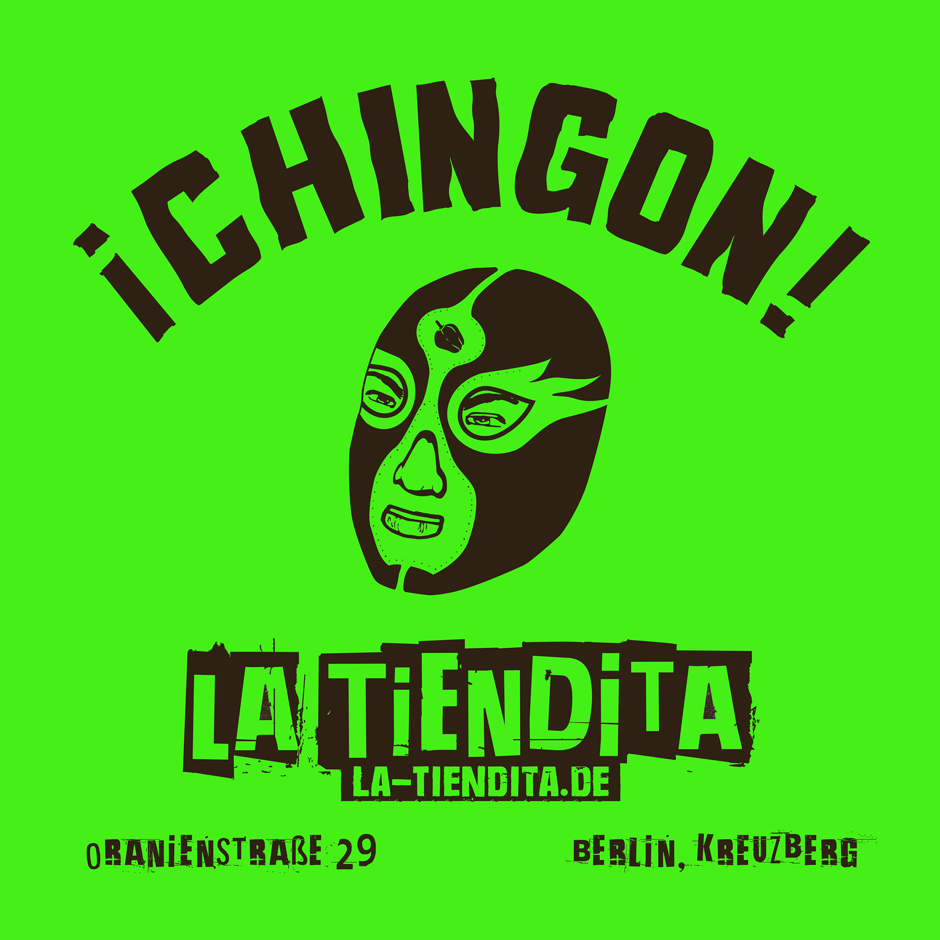
To bridge this cultural and aesthetic gap, the design draws from one of Mexico’s most rebellious and energetic symbols—the Luchador. This punk-rock essence of lucha libre was paired with a grunge-style typeface, evoking a hand-finished, DIY aesthetic that feels both raw and intentional. The result is an identity that feels bold, rooted in Mexican culture, and naturally at home in the heart of Berlin’s Neukölln.
Design Execution
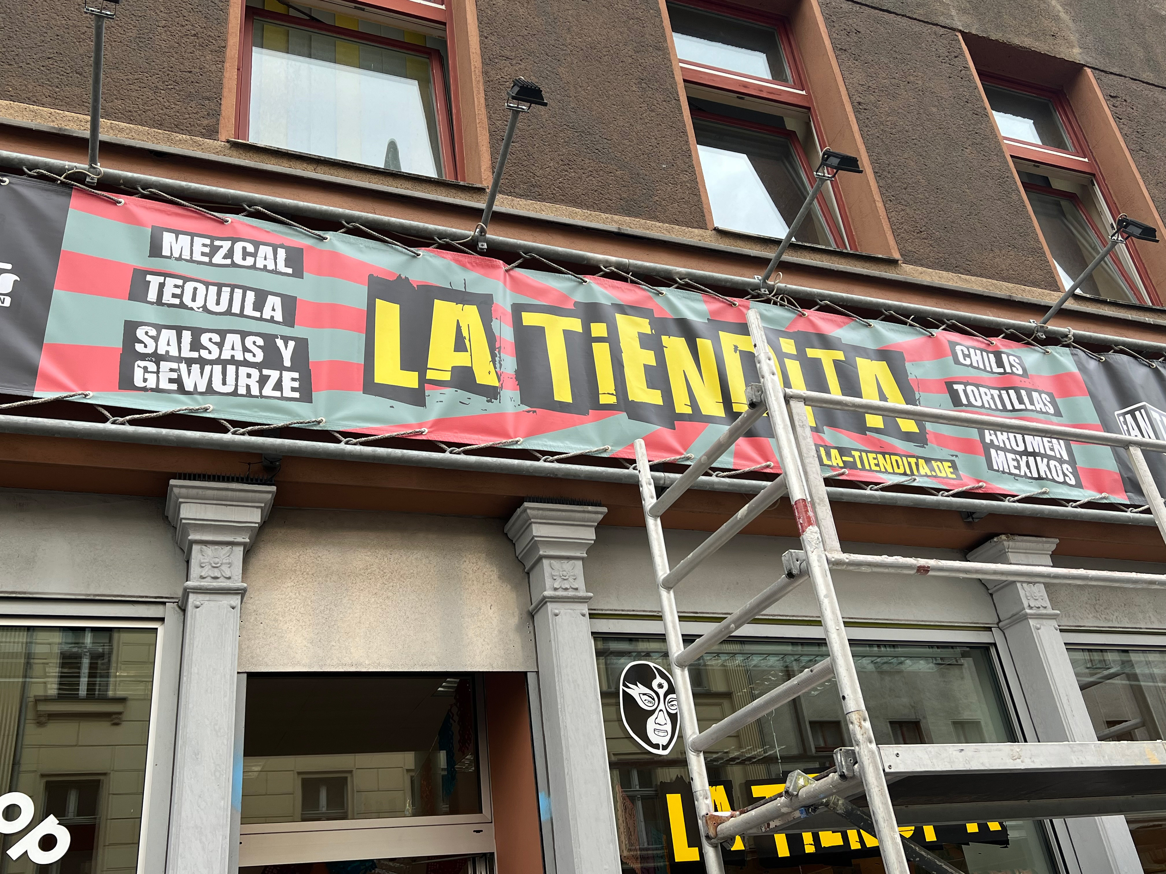
Storefront & Signage:
The storefront banner features a striking yellow-and-black grunge typeface against a red-and-green striped backdrop, mirroring the textures of lucha libre posters.
A distressed, stencil-like application of “LA TIENDITA” gives an urban, punk-inspired feel while maintaining clear readability.
The luchador mask icon reinforces the brand’s spirit and acts as a visual shorthand for authenticity and energy.
Printed Collateral:
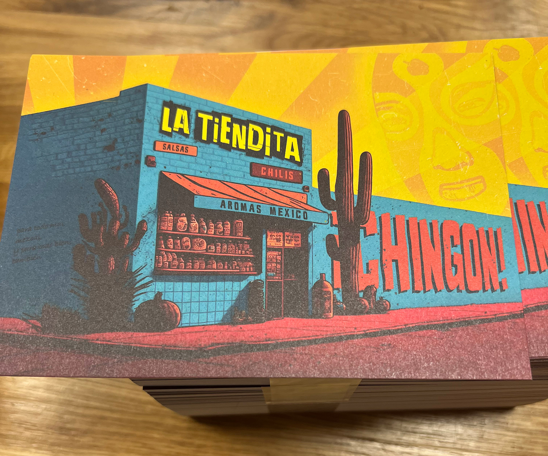
Postcards & Flyers feature a high-contrast, vintage comic-book illustration of a Mexican storefront, set against a warm, desert-inspired gradient with bold typographic elements. The background includes subtle Luchador motifs for an added layer of brand storytelling.
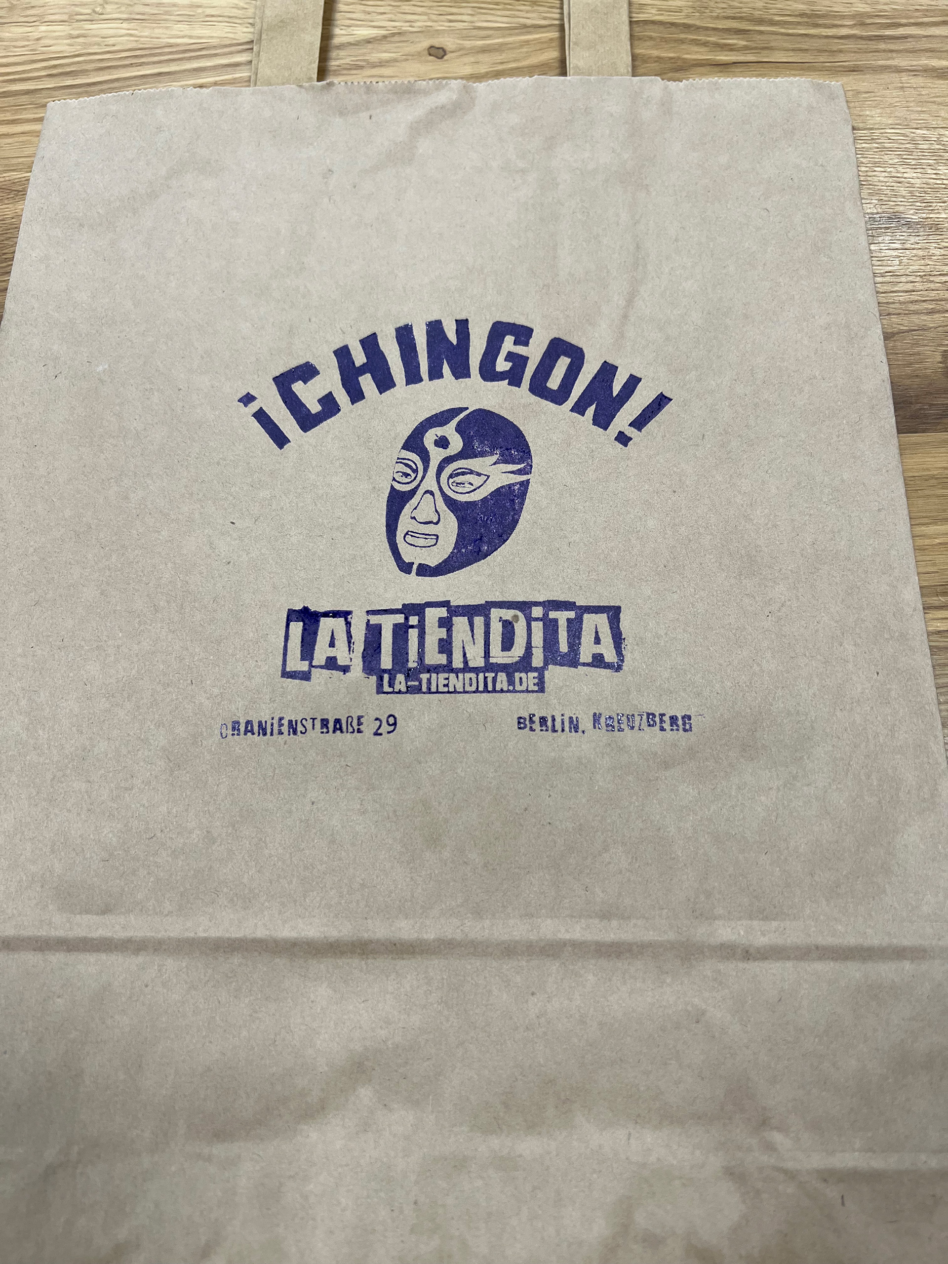
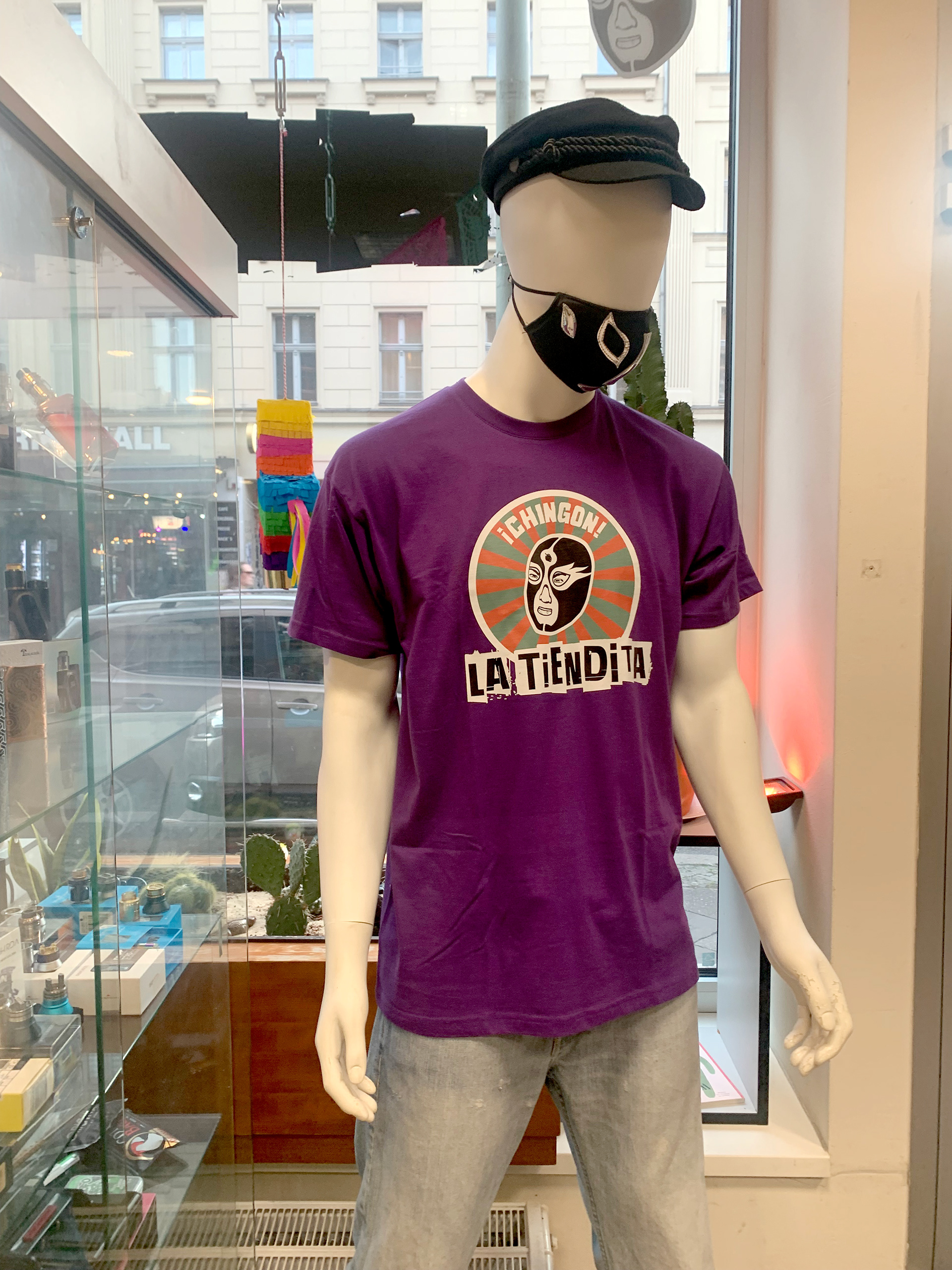
Paper Bags are stamped with the luchador logo and the phrase “¡CHINGON!,” a slang term meaning “awesome” or “badass,” printed in rough, textured ink to emulate handmade branding.
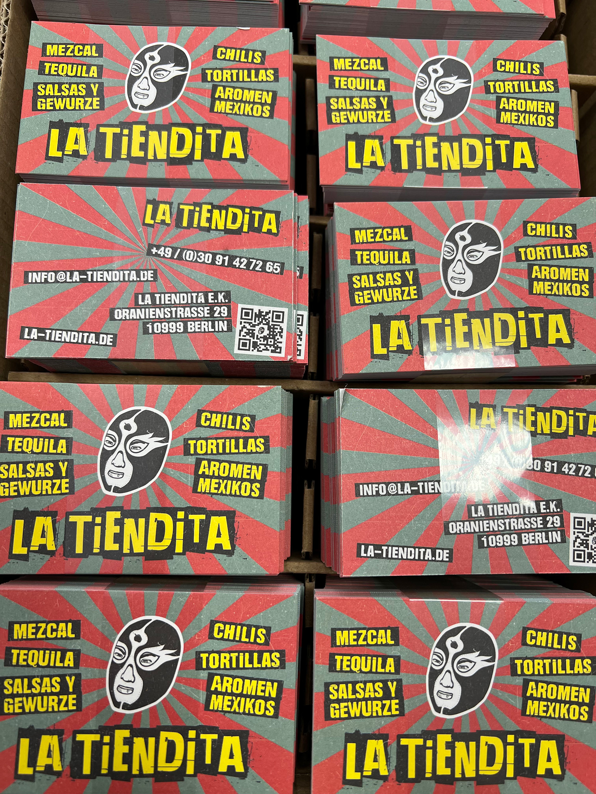
Color Palette & Typography:
Colors: A high-impact mix of electric yellow, deep red, and grunge black creates a striking yet organic aesthetic.
Typography: A distressed, stencil-style typeface for the logo paired with a secondary sans-serif font for legibility and contrast.
Outcome & Impact:
The identity successfully positions LA TIENDITA as a cultural beacon within Neukölln, merging Mexican heritage with Berlin’s punk underground.
The branding’s hand-finished aesthetic fosters an immediate sense of authenticity, avoiding the overly polished look of corporate branding.
The storefront and collateral design captivate passersby while feeling seamlessly integrated into the local streetscape.
Conclusion:
By embracing the rebellious energy of Mexican Lucha Libre and blending it with Berlin’s DIY aesthetic, LA TIENDITA’s brand identity has transformed the store into a standout landmark. The project illustrates how cultural authenticity can be reinterpreted in a way that resonates with a local audience while staying true to its roots.